Solana Wash Trading Dashboard
This script runs an interactive Streamlit web application that:
- Loads fresh Solana DEX trade data from Bitquery.
- Applies a trained XGBoost model to detect wash trading.
- Calculates various risk metrics.
- Displays dynamic, real-time visualizations.
Code Braakdown
Imports
Refer to the file structure to make sure that the imports are correct.
import streamlit as st
import pandas as pd
import pickle
import matplotlib.pyplot as plt
from sklearn.preprocessing import LabelEncoder
import plotly.graph_objects as go
import json
from get_data import get_trades
Load Model and Features
The code given below loads your pre-trained XGBoost model and the feature list used during training to ensure correct column alignment.
model = pickle.load(open("xgb_wash_model.pkl", "rb"))

with open("model_features.json", "r") as f:
    feature_cols = json.load(f)
Fetch and Prepare Data
This code fetch the latest Solana DEX trades using Bitquery API, flattens nested JSON into a usable DataFrame, encode categorical features and align the data with training features.
trade_data = get_trades()
df = pd.json_normalize(trade_data)

X = df.copy()

for col in X.select_dtypes(include="object").columns:
    X[col] = LabelEncoder().fit_transform(X[col].astype(str))

for col in feature_cols:
    if col not in X.columns:
        X[col] = 0
X = X[feature_cols]
Run Predictions and Compute Risk Score
This code adds a new column prediction indicating suspected wash trades and computes an overall risk score (0–100).
df["prediction"] = model.predict(X)
wash_count = int(df["prediction"].sum())
total_trades = len(df)
risk_score = min(100, int((wash_count / total_trades) * 100)) if total_trades else 0
Compute Key Metrics
The code given below returns:
- Cleaned timestamp for resampling.
- Buy volume in USD
- Suspicious volume based on model prediction
- Top 10 wallets' volume share
- Most active wallet’s trade contribution
- % of volume flagged as suspicious
df["timestamp"] = pd.to_datetime(df["Block.Time"], errors="coerce")
df["volume"] = pd.to_numeric(df["Trade.Buy.AmountInUSD"], errors="coerce").fillna(0)
df["suspiciousVolume"] = df.apply(
    lambda row: row["volume"] if row["prediction"] == 1 else 0,
    axis=1
)
top_wallets = df.groupby("Trade.Buy.Account.Address")["volume"].sum().sort_values(ascending=False)

total_volume = top_wallets.sum()
top_10_volume = top_wallets.head(10).sum()
volume_concentration = round(100 * top_10_volume / total_volume, 2)

top_wallet_trade_count = df["Trade.Buy.Account.Address"].value_counts().iloc[0]
wallet_contribution = round(100 * top_wallet_trade_count / len(df), 2)

wash_volume_pct = round(100 * df["suspiciousVolume"].sum() / df["volume"].sum(), 2)
Streamlit App Setup
This code initializes the Streamlit app with a title and a button.
st.set_page_config(page_title="Solana Wash Trade Risk Dashboard", layout="wide")
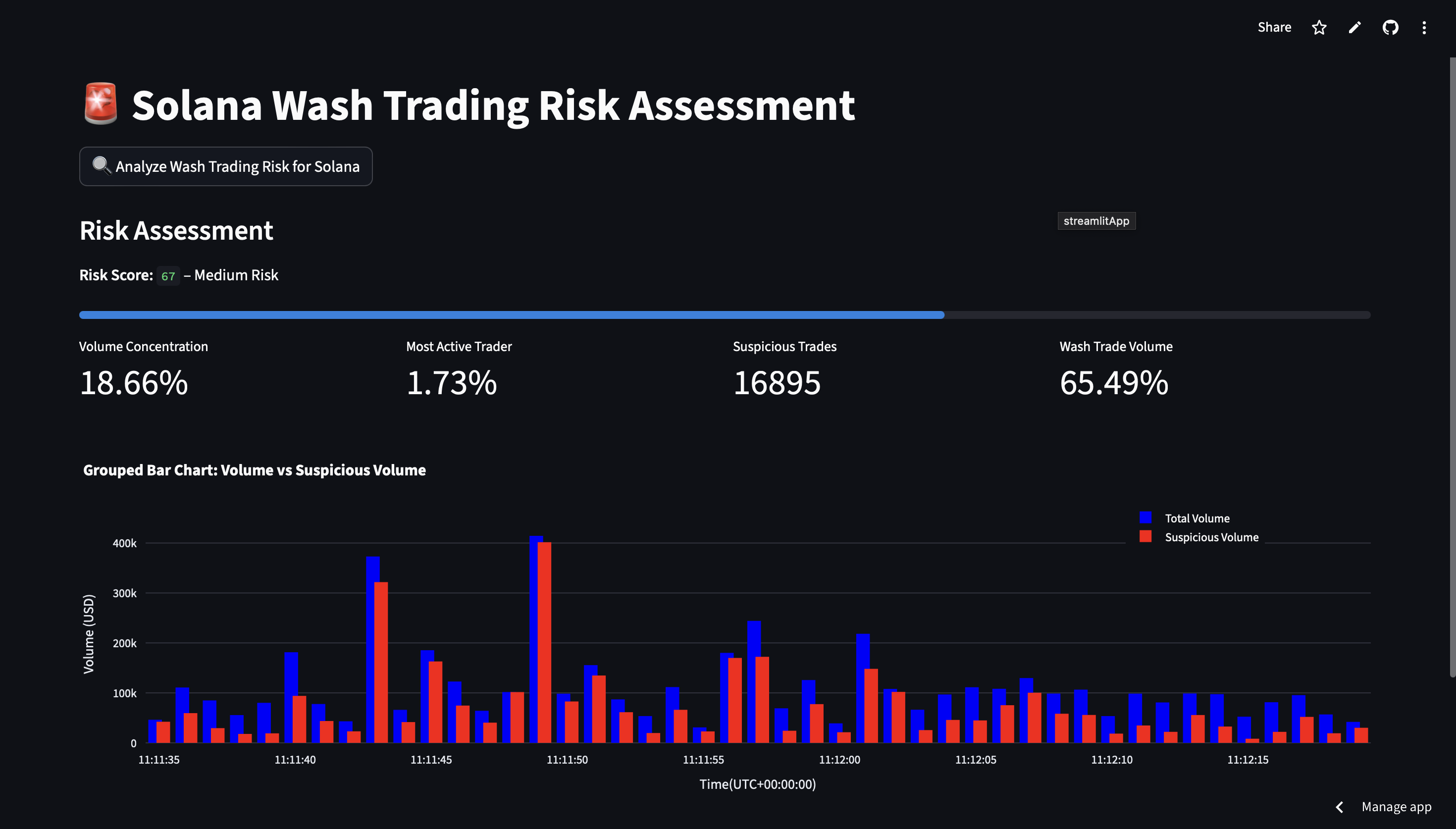
st.title("🚨 Solana Wash Trading Risk Assessment")
st.button("🔍 Analyze Wash Trading Risk for Solana")
Show Risk Metrics
The below code renders Risk Score and Trading Metrics on the Streamlit app.
st.subheader("Risk Assessment")
st.markdown(f"**Risk Score: `{risk_score}`** – {'High' if risk_score > 70 else 'Medium' if risk_score > 40 else 'Low'} Risk")
st.progress(risk_score / 100)

col1, col2, col3, col4 = st.columns(4)
col1.metric("Volume Concentration", f"{volume_concentration}%")
col2.metric("Most Active Trader", f"{wallet_contribution}%")
col3.metric("Suspicious Trades", f"{wash_count}")
col4.metric("Wash Trade Volume", f"{wash_volume_pct}%")
Plot Volume Chart (Total vs Suspicious)
The below code renders a bar chart of total trade volume v/s the suspicious volume for a timeframe of 1s.
df.set_index("timestamp", inplace=True)
agg = df.resample("1s").agg({
    "volume": "sum",
    "suspiciousVolume": "sum"
}).fillna(0).reset_index()

fig = go.Figure()

# Blue bars = total volume
fig.add_trace(go.Bar(
    x=agg["timestamp"],
    y=agg["volume"],
    name="Total Volume",
    marker_color="blue",
    width=500
))

# Red bars = suspicious volume
fig.add_trace(go.Bar(
    x=agg["timestamp"],
    y=agg["suspiciousVolume"],
    name="Suspicious Volume",
    marker_color="red",
    width=500
))

fig.update_layout(
    barmode="group",
    title="Grouped Bar Chart: Volume vs Suspicious Volume",
    xaxis_title="Time(UTC+00:00:00)",
    yaxis_title="Volume (USD)",
    xaxis_tickformat="%H:%M:%S",
    legend=dict(x=0.8, y=1.1),
    bargap=0.4,
    bargroupgap=0.1,
    height=400,
)

st.plotly_chart(fig, use_container_width=True)
Raw Data Toggle
The below code allows to optionally show the full processed dataset (including predictions and timestamps).
if st.checkbox("Show Raw Trade Data"):
    st.dataframe(df)
Deployment via Streamlit
You can deploy this dashboard to Streamlit Cloud in a few easy steps just as this Live Demo.
Add requirements.txt
In the project repository add the following requirements.txt file.
streamlit
pandas
scikit-learn
xgboost
matplotlib
plotly
Deploy on Streamlit Cloud
- Go to Streamlit Cloud.
- Click "New App".
- Connect your GitHub repo.
- Set app.py as the entry point.
- Add your access token in Secrets.
- Click Deploy.
Final Product
The final product looks like the image given below.