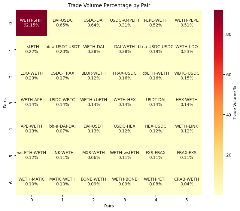
In this tutorial, we'll walk you through how to visualize the trade volume of different Ethereum pairs in a Heatmap using Python, pandas, seaborn, matplotlib, and the Bitquery DEX Trades API.
Step 1: Import necessary libraries
First, we need to import the necessary libraries. We'll be using numpy for numerical operations, seaborn and matplotlib for data visualization, requests for making HTTP requests, and pandas for data manipulation.
import numpy as np
import seaborn as sn
import matplotlib.pyplot as plt
import requests
import pandas as pd
Step 2: Make an API request
Next, we'll make a request to the Bitquery v1 Dextrades API to get the Ethereum trading data.
In the below query we are getting the top 50 tokens sorted by buy_amount_usd which is an alias for the total buy amount in USD for that period. For the top tokens, we are getting the amount and USD value of the sell and buy orders, and the count of trades.
We'll specify our query and parameters in the payload and headers and send the request. Remember to put the correct API KEY in the API_KEY parameter and the Bearer token in Authorization.
url = "https://graphql.bitquery.io"
payload = {
    "query": """
query ($network: EthereumNetwork!, $limit: Int!, $offset: Int!, $from: ISO8601DateTime, $till: ISO8601DateTime) {
  ethereum(network: $network) {
    dexTrades(
      options: {desc: "buy_amount_usd", limit: $limit, offset: $offset}
      date: {since: $from, till: $till}
    ) {
      sellCurrency {
        symbol
        address
      }
      sellAmount
      sell_amount_usd: sellAmount(in: USD)
      buyCurrency {
        symbol
        address
      }
      buyAmount
      buy_amount_usd: buyAmount(in: USD)
      count
    }
  }
}


""",
    "variables": {
        "limit": 50,
        "offset": 0,
        "network": "ethereum",
        "from": "2023-01-01",
        "till": "2023-06-12T23:59:59",
        "dateFormat": "%Y-%m-%d"
    }
}
headers = {
    'Content-Type': 'application/json'
    'Authorization': 'Bearer ory_at_...'
}

response = requests.post(url, headers=headers, json=payload)
response.raise_for_status()  # Raise an exception for bad responses
Step 3: Extract and normalize data
After getting the response, we'll extract the data from the JSON response and normalize it into a pandas DataFrame.
data_json = response.json()
trades = data_json['data']['ethereum']['dexTrades']
df = pd.json_normalize(trades)
Step 4: Data manipulation
Next, we'll manipulate the DataFrame to add new columns and filter out specific pairs.
We are coming the buy-sell token symbols to form the pair column. Since the stablecoins are traded regularlya nd with good liquidity, we will visualize only other tokens.
df['pair'] = df['sellCurrency.symbol'] + '-' + df['buyCurrency.symbol']
pairs_to_remove = ['WETH-USDT', 'USDT-WETH', 'USDT-USDC', 'WBTC-WETH','WETH-USDC','USDC-WETH','USDC-USDT','WETH-WBTC']
df = df[~df['pair'].isin(pairs_to_remove)]
df['total_trade_volume'] = df['sell_amount_usd'] + df['buy_amount_usd']
df['trade_volume_percentage'] = (df['total_trade_volume'] / df['total_trade_volume'].sum()) * 100
Step 5: Reshape data and create annotations
We'll then reshape the data and create annotations for our heatmap. We use variables x,y to set dimensions of the heatmap.
x=7
y=6
pairs_reshaped = df['pair'].values.reshape(x, y)
trade_volume_percentage_reshaped = df['trade_volume_percentage'].values.reshape(x, y)
annotations = [f"{pair}\n{value:.2f}%" for pair, value in zip(pairs_reshaped.flatten(), trade_volume_percentage_reshaped.flatten())]
annotations = np.array(annotations).reshape(x, y)
Step 6: Plotting heatmap
Finally, we'll plot the heatmap using seaborn. The heatmap will show the trade volume percentage of each Ethereum pair.
plt.figure(figsize=(10, 8))
sn.heatmap(trade_volume_percentage_reshaped, annot=annotations, fmt="", cmap='YlOrRd', cbar_kws={'label': 'Trade Volume %'})
plt.title('Trade Volume Percentage by Pair')
plt.xlabel('Pairs')
plt.ylabel('Pairs')
plt.show()
The image will look something like the one below. If the data is skewed towards one pair ( large amount of trades), then it is better to filter it or find alternate methods to get a holistic view.